'Rapid Rumble' is a competitive card game based on classics such as Yu-Gi-Oh!, Hearthstone and Magic: The Gathering. However, it deliberately avoids pay-to-win mechanics and complex deck building. The aim was to create a game that can be played straight away, is easy to understand, and still offers strategic depth.
Together with two fellow students, the game mechanics were developed in which two players face each other in quick, turn-based duels with a common set of number cards and a few special cards. Rather than having to buy or collect cards, the set includes everything needed for a fair game. The focus is on tactics, reactions, and the clever use of available cards, rather than external card value.
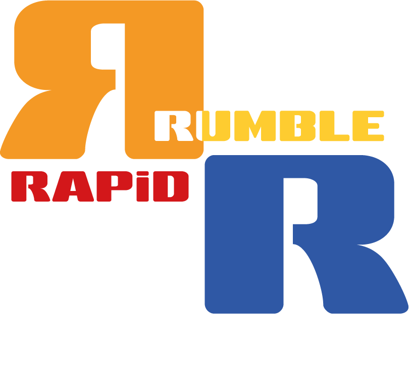
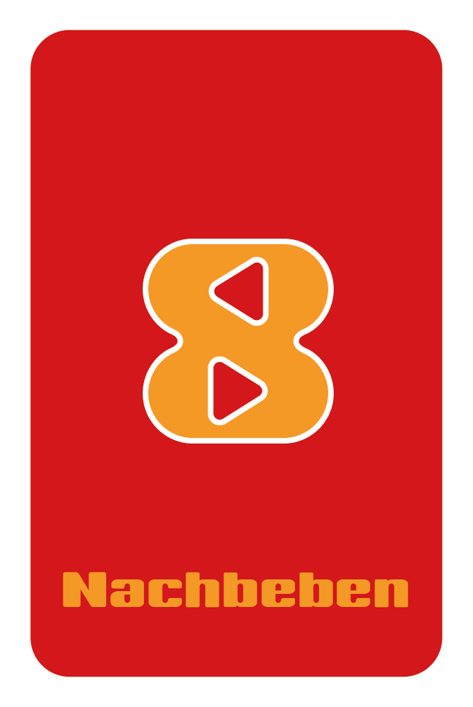
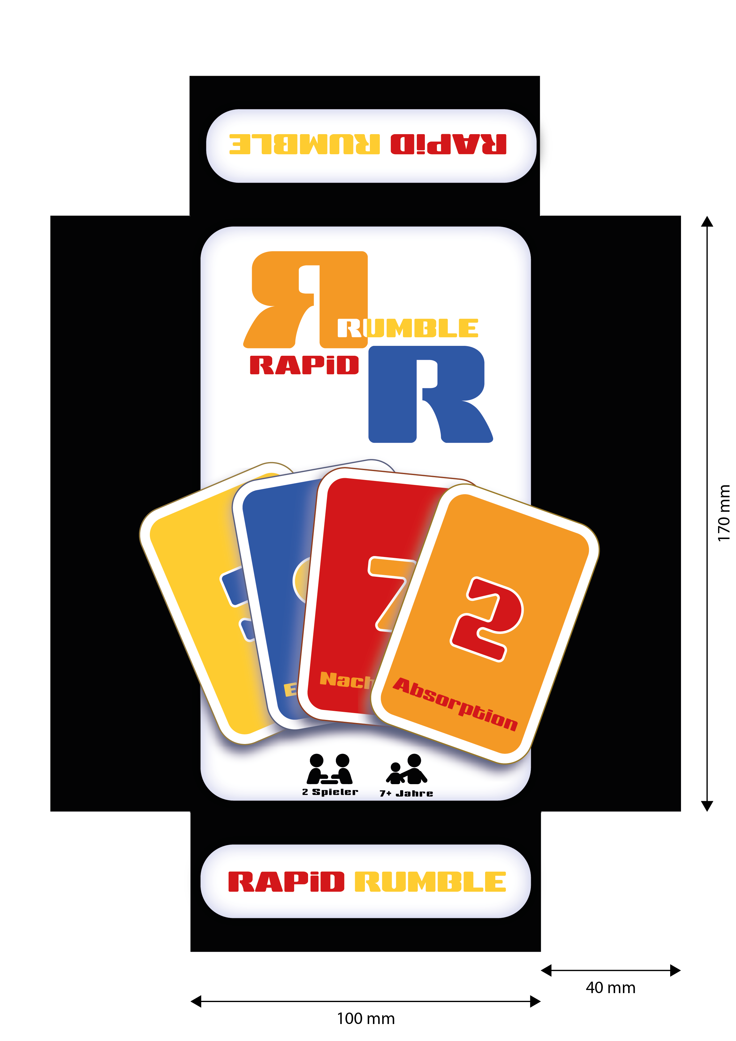
I developed the visual appearance entirely myself, including the logo, card design, colour system and packaging. In terms of colour, the game is based on a powerful primary colour concept (red, yellow, blue and orange) that signals energy, excitement and fun. The typography borrows from retro-futuristic arcade aesthetics, matching the game's fast-paced, combative nature.
The logo's mirror-image 'R' symbolises the clash between two equal players. The backs of the cards and the packaging design fit harmoniously with the brand identity, enabling recognition even amongst other games.